Qiskit Metal
Using design thinking activities to find pain points and improve the experience for quantum chip designers.

The opportunity
As the Qiskit Metal project began to gain adoption, the core team reached out to our digital experiences team for UX design consultation.
The user interface offered a lot of functionality, however the overall look and feel of the application needed a little love. This was the perfect opportunity for design to step in and help with the following areas:
- ☐The usage of color was vast, and the iconography lacked a cohesive system
- ☐Various elements in the UI competed with one another
- ☐Users had to split their workflow between two tools: Jupyter Notebooks and the Qiskit Metal UI
The Qiskit Metal user interface (before).


Roles & contributions
Owning this engagement required me to step in as the representative for our design team. I relied on leadership from our Senior Design Lead, Russell Huffman, but was responsible for facilitating communication between the Metal team and ours.
I also asked to pull in two other helpful designers, Terra Banal and Tobi Lasisi. Together, we planned a design thinking workshop to identify pain points and gain team alignment.
Activities
- Low / high fidelity designing
- User testing
- Hills workshop
- Rapid prototyping
- Sponsor user interviews
- Agile iterations
Solution
Our design workshop was a success. We had 9 people meet over the course of 3 half-day sessions, including full participation by the Metal team. During that time, we were able to arrive at an improved user experience by exposing a few issues in user onboarding and the multi-tool workflow.
After an initial planning session, we facilitated a design thinking workshop.


Explorations
Started by bringing user flows into Figma and exploring first time user experience.


Screens
An improved Getting Started design and a more cohesive user interface.

Deliverables
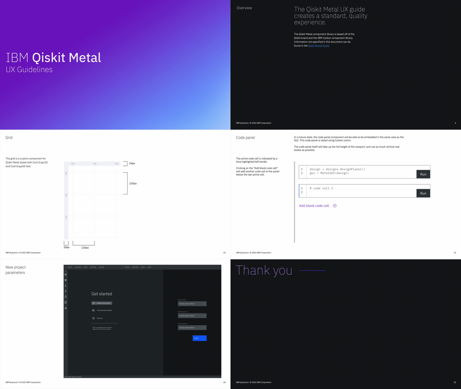
By the end of our collaboration, we were able to provide the Qiskit Metal team with UX guidelines and a design system to continue building their application. The goal was to ensure that their UI engineer had all the necessary resources to implement the proposed designs.
- ☑The UI was cleaned up with improved typography, colors, and iconography
- ☑With the slideout code editor panel, users can stay within one application instead of splitting their workflow into two apps
- ☑The onboarding experience allowed users to get to where they needed to start, in a simpler experience
Learn more
Read about the Qiskit Metal project by visiting their repository.
A preview of the UX Guidelines delivered to the Qiskit Metal team.

I’m here to help
My inbox is open for anyone looking to explore potential collaborations. Whether you’re interested in discussing design or development, have speaking or writing opportunities, or are looking for mentorship, connect with me on LinkedIn.